
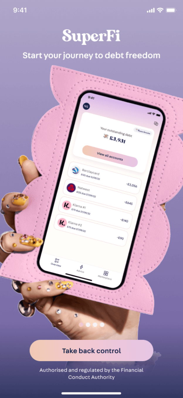
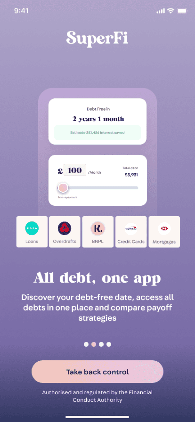
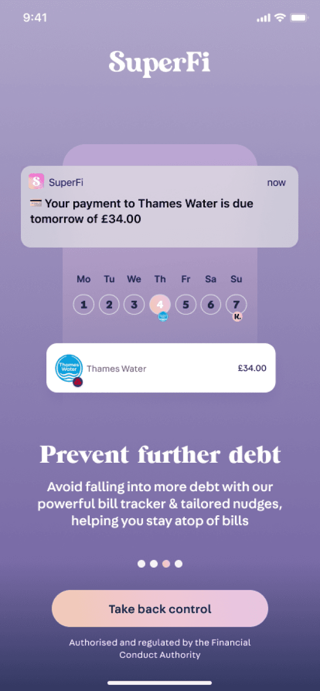
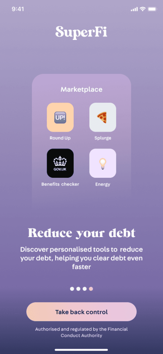
Designed Superfi’s intro screens to improve the onboarding experience
About Superfi
A debt management app helping to fight the cost of living crisis.
SuperFi is a fintech startup making debt management easier for people. Their goal is to give access to debt solutions, preventing more people from falling further into debt. This is increasingly relevant today with the cost of living crisis looming and more people are likely to default on their loans than ever before.
The mobile app allows people to manage all their debts in one place, to help track bill payments, and provide tips and suggestions to reduce debt overall.
Target Market / Personas
People who are struggling to afford their monthly bill commitments and obligations, living pay check to pay check. They have growing debt and want to find ways to get rid of their debt faster.
Info
Role
Junior Product Design (intern)
Team
CPO + Dev Agency + Me
Responsibilities
Wireframes, Hi-fi prototyping, User testing, UX research, Visual design
Project Duration
4+ weeks
Status
In development
Overview & Product Goals
The Problem
How can we improve conversion rate from app download to sign up?
How can we create a delightful user experience in the onboarding flow, enticing users to complete the entire onboarding process?
My Task
Designing the introductory screens and integrating these seamlessly into the existing onboarding journey, as a result, improving the entire onboarding experience.
The key focus is ensuring there is no user drop off, engaging users after installation of the app and encourage users continue exploring the app, are propelled to sign on and complete the entire onboarding process.
Designing for the user
The Goal
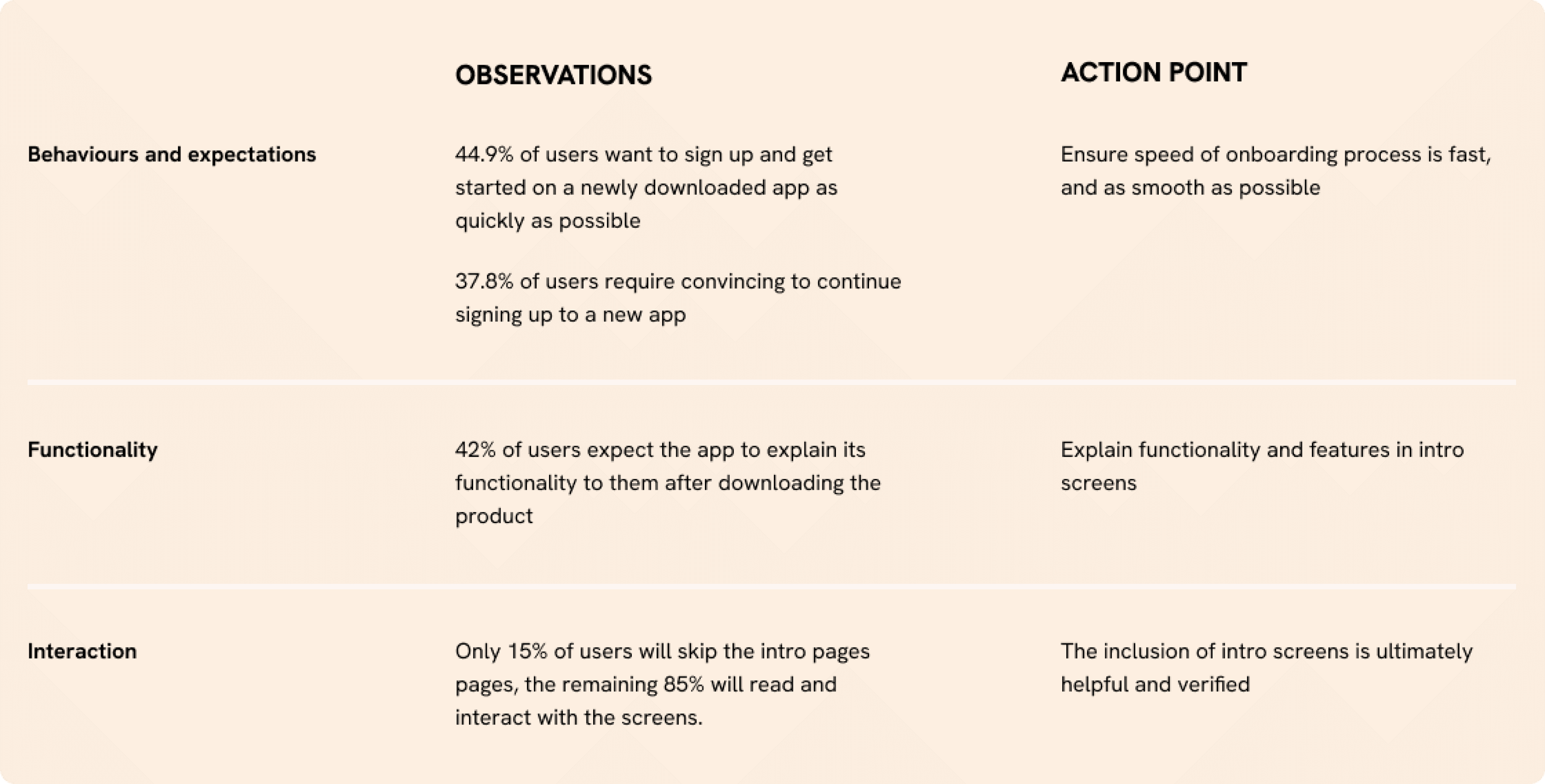
To kick things off, we wanted to understand how important are introductory screens to the user in the first place. We needed to verify the users needs in the onboarding process, and to understand what they expect from intro screens.
Method
A quantitative & qualitative survey, targeting a sample size of 100 people living in the UK.
Results
Key takeaways
We understood that adding introductory screens were a necessary part of the onboarding experience for SuperFi.
Majority of people signing up for a new app read the introductory screens to better understand the functionality offered.
The results defined the design goals. The intro screens had to be ‘quick & smooth’ and ‘explain functionality and features of the app’
Understanding the industry and market
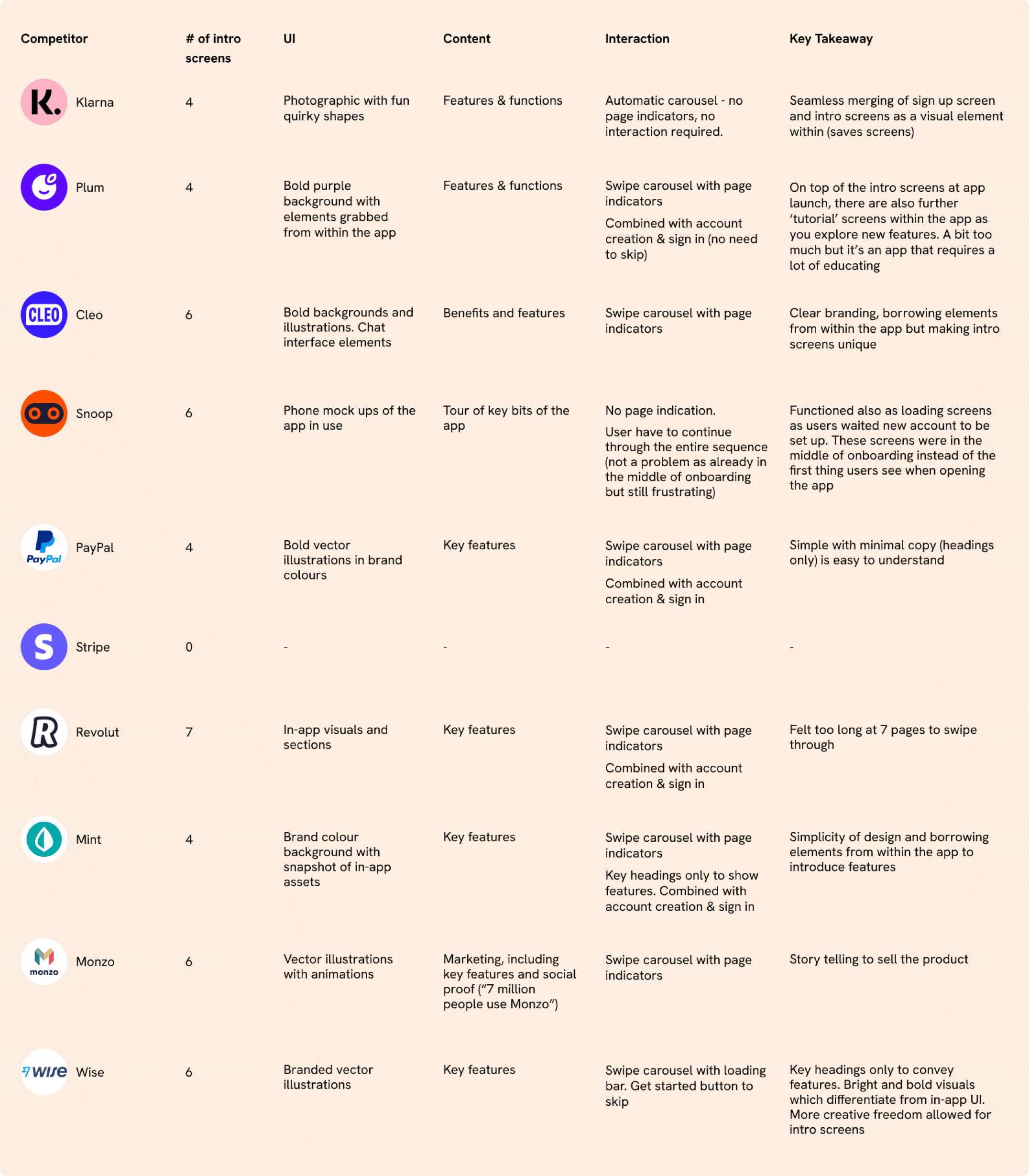
Goal
To understand what’s working out there.
To inspect visual elements as well as composition and content.
Method
I took a look at competitors to guide my ideation and first sketches.
Result
We learnt that...
Important to always give the user freedom and control to skip
The sequence cannot be too long
Indication of what to expect within the app (functions & features)
Visually can be bold and fun, differentiating from in-app, as a way to draw users in
Introductory screens vary a lot visually on the brand but there are similar patterns
Ideation
Content
Distilling the key features and functions of the app to show in the intro screens:
Track your debt balance
Clear debt faster/reduce debt
Find help with payments
Interaction Design
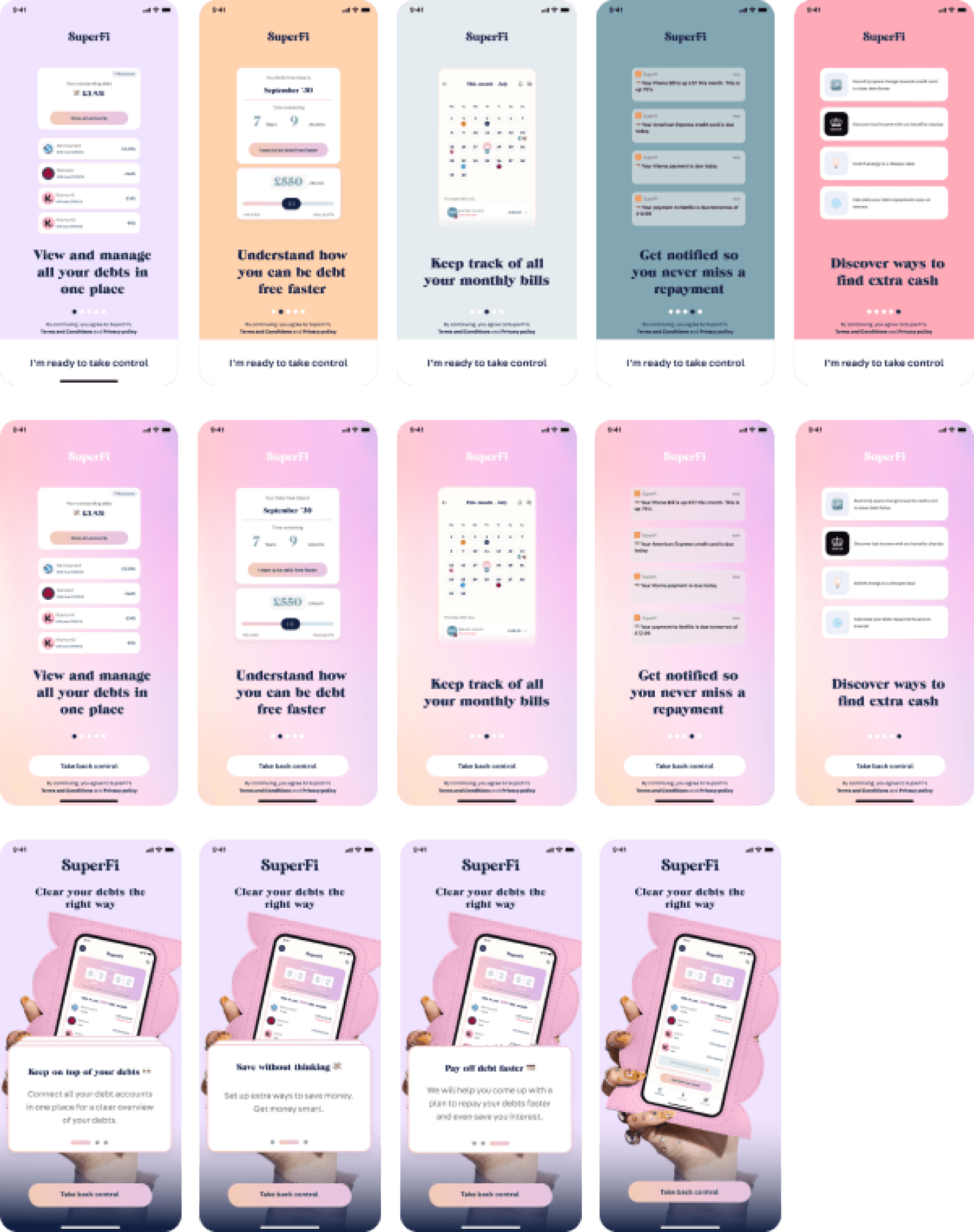
I tried to explore different interactions for the intro screens - wanting to go beyond the standard swiping through pages. These did not turn out well 😅
Result
Feedback from design critiques & testing:
Inconsistent imagery - mix of assets from within the app and also mock up as well
Imagery also too detailed and requires too much time for users to
Heading only - text is not very legible. Explore using header + subtext
Consider animation and how each screen will transition to another (especially from one colour to another)
Features and functions are unclear - too detailed perhaps. In a brief survey test, majority of users did not understand the functions of this app and assumed it was about saving extra cash instead of debt management
UX Flow
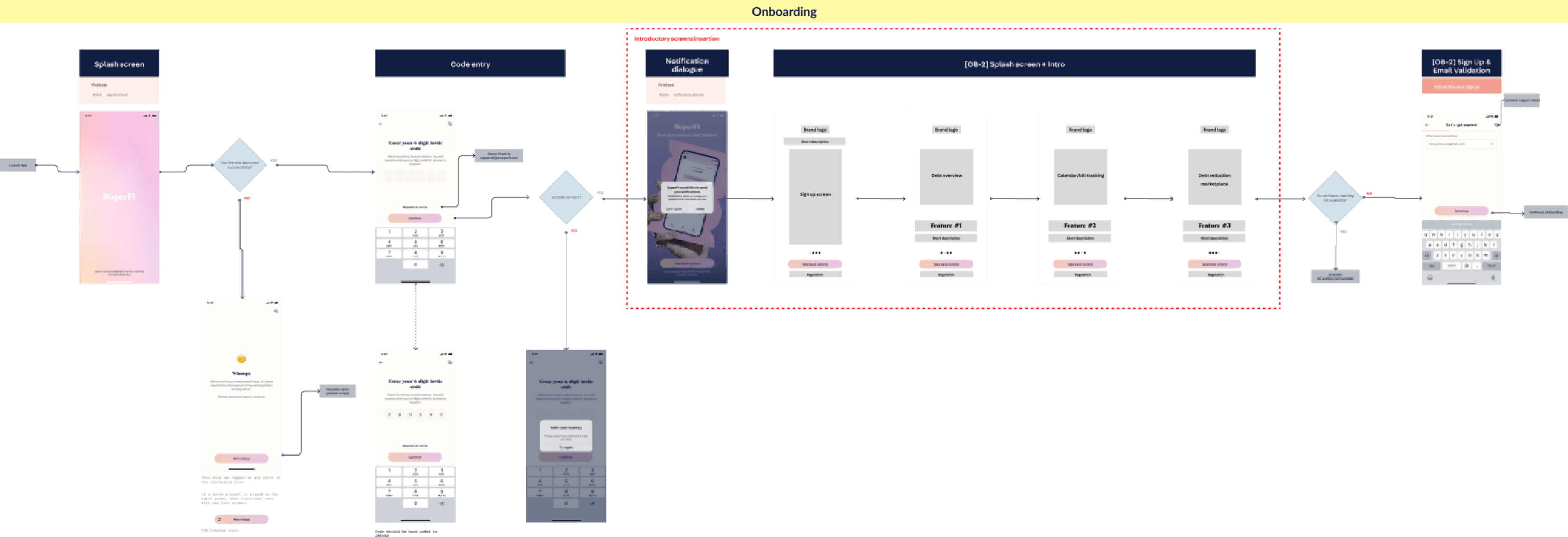
Understanding where exactly in the onboarding flow these introductory screens can be integrated to, also influenced the design of the screens. Knowing the previous screen and the following screen was integral making the experience smooth.
After consideration, existing screens had to be adjusted slightly (conscious of development costs) to create a seamless flow. The compromise to the design would have been too great if we didn’t.
User testing & Iterations
Goal
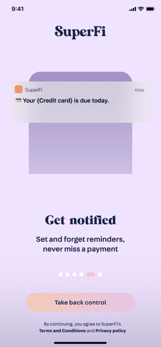
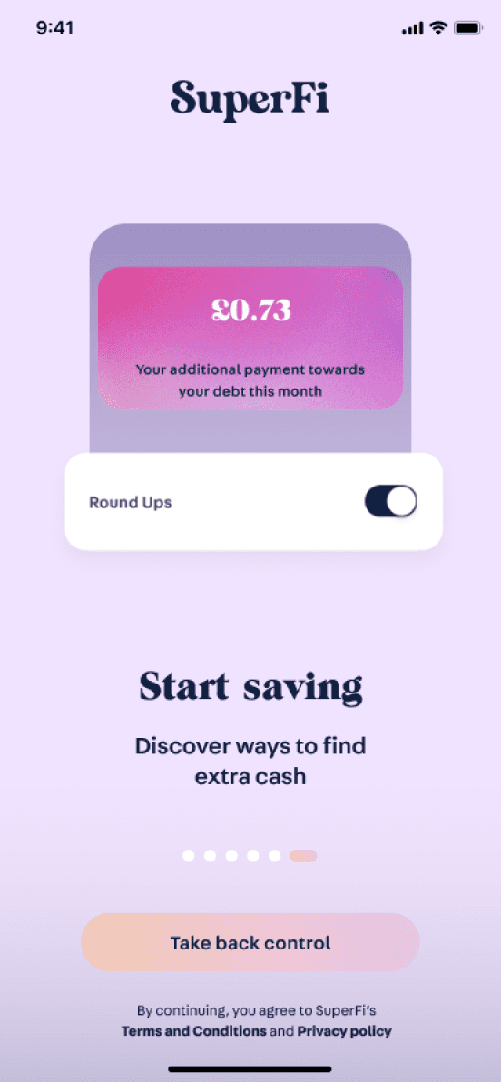
After iterations from first round’s critique, a second round of designs was finalised for testing. To discover if the user understands:
The function of the SuperFi app from the intro pages
The main features they can expect to see within the app
The visual aspects and components of the app (the look and feel)
Method
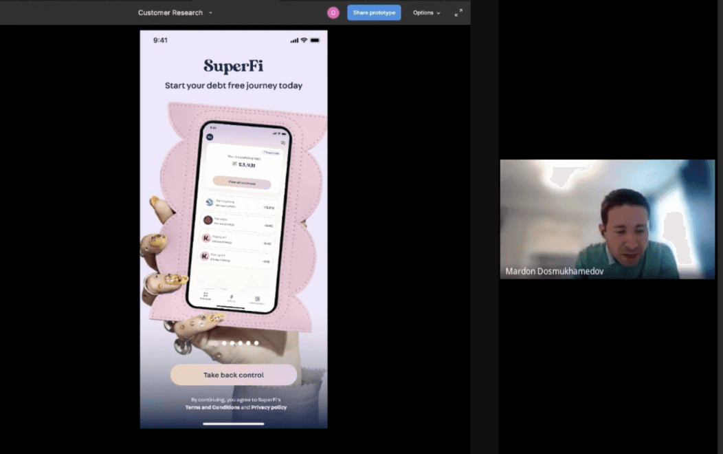
Remote usability testing of prototype
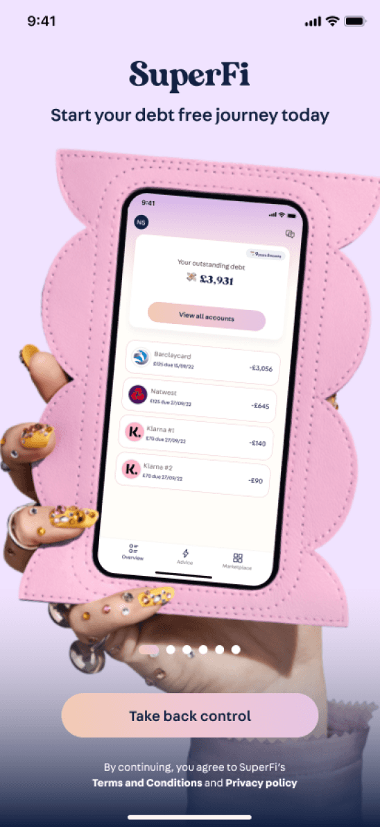
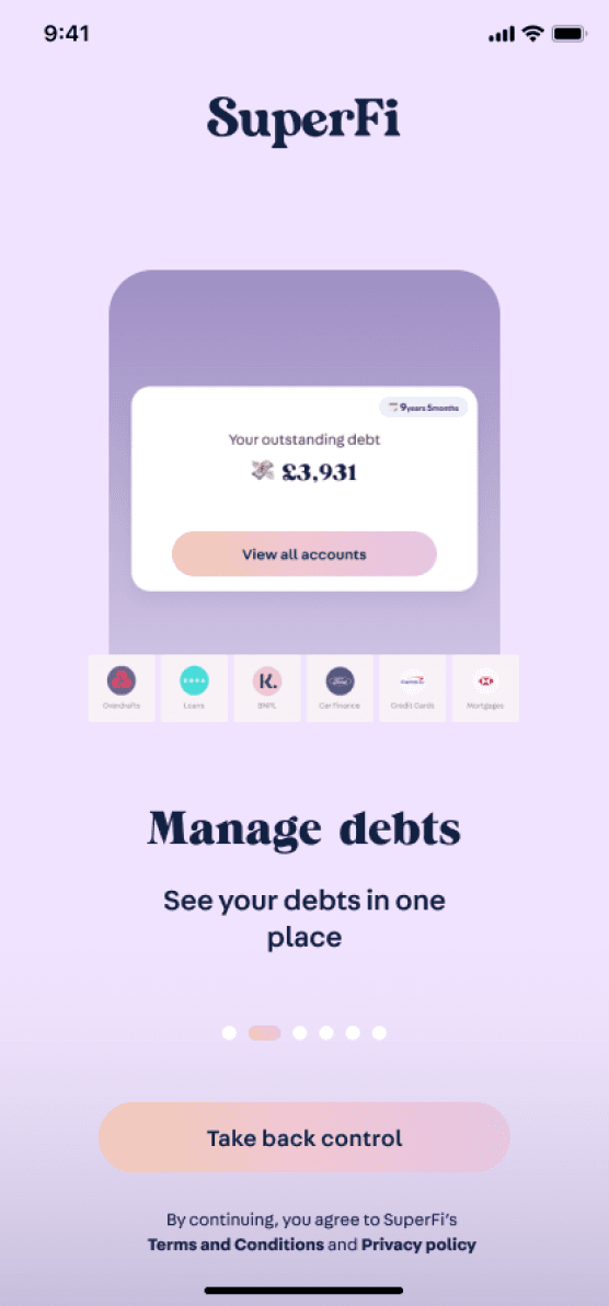
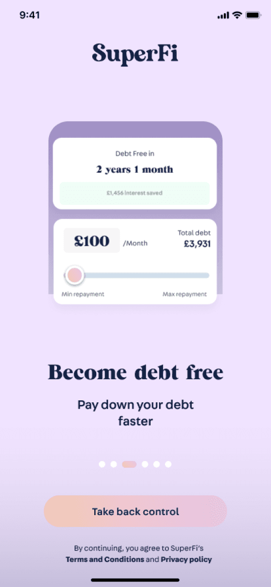
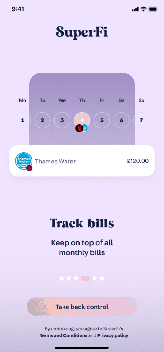
Result
We learnt that…
Page indicators were unclear - users attentions were drawn to the main CTA instead of swiping through pages.
Too many screens - and some were repeats of others. The content needed to be consolidated
Users were not enticed or were confused by some features - these needed to be more appealing and message made more clear
3/3 users would continue to sign up and use this app
Visuals and colours were well received
Users understood that these show a snapshot of features, and understood the purpose of the app
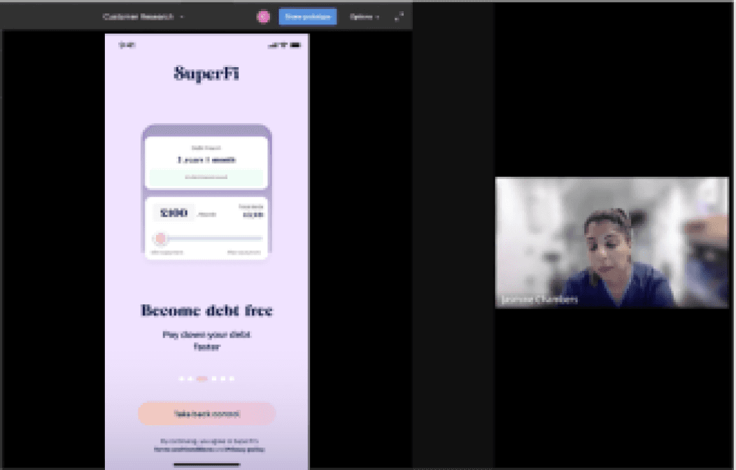
In Development
Design iterations were made as a result of the user tests and a revised design has been handed over to the development agency. Until we launch the product live, we won’t be able to get any metrics on how successful the intro screens are.
Although it seemed mighty simple, these designs underwent many testing and iterations. Due to the heavy emphasis on visual elements instead of functionality, it took many variations to end up with a design the CPO and I were happy with... for now.
Coffee? I’d love to connect
I’m in Melbourne, Australia
deborah.zhong@gmail.com
+61 413 450 285
Home
About
Work
Contact