Redesigned shoppers experience to increase conversion by 35%
Redesigned shoppers experience to increase conversion by 35%
Redesigned shoppers experience to increase conversion by 35%

OVERVIEW
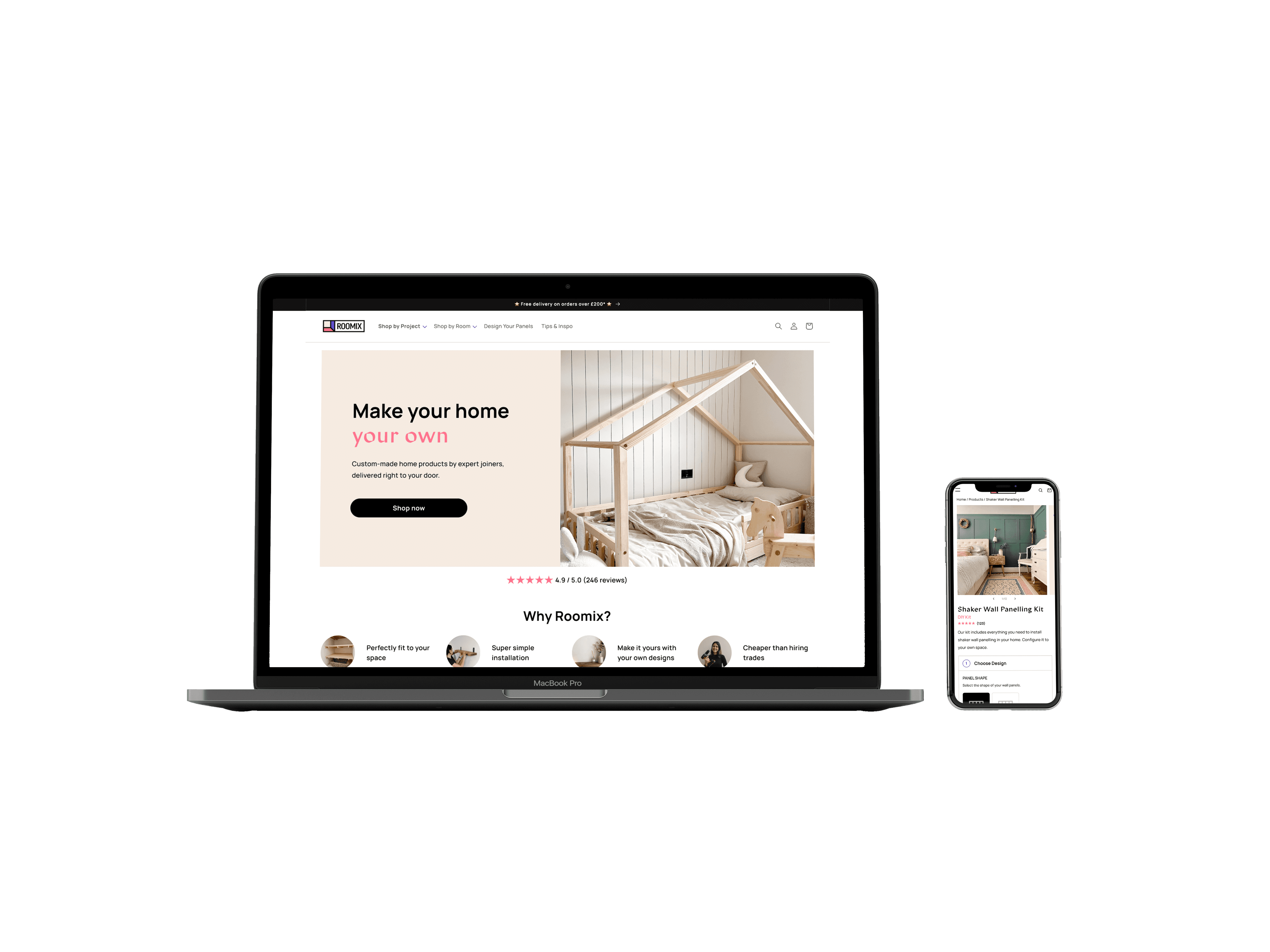
Roomix sells DIY wall panelling and shelving products online where customers can customise to their space and style. However they are looking to expand their product offering even more, into kids furniture, radiator covers etc.
Their website needs to be able to facilitate this product growth, to reflect this shift in direction and to be able support the customisation of a wide range of new product specifications. To address this, we set out to revamp the home page and product page, prioritising modular functionality while also taking this opportunity to improve conversion rate and fix usability issues.
TEAM
Product Manager + Developer + Me
Product Manager + Developer + Me
TOOLS
Figma, Notion, Hotjar, Useberry (user testing)
Figma, Notion, Hotjar, Useberry (user testing)
TIMELINE
Dec - Jan 2024. Live now.
Dec - Jan 2024. Live now.
ROLE
Synthesise user feedback and insights from testing to lead end-to-end design of the debt repayment calculator tool. Create specifications for final design to hand over to the dev agency.
Synthesise user feedback and insights from testing to lead end-to-end design of the debt repayment calculator tool. Create specifications for final design to hand over to the dev agency.
VIEW WEBSITE
→
RESEARCH
Analysing data we gathered of the current website, we discovered areas of friction around navigation, usability and content.
Analysing data we gathered of the current website, we discovered areas of friction around navigation, usability and content.
Analysing data we gathered of the current website, we discovered areas of friction around navigation, usability and content.
Research methods employed:
User interview
Competitor analysis
Heatmap analysis
UX heuristic audit
KEY FINDINGS
KEY FINDINGS
KEY FINDINGS
OBJECTIVES IN IDEATION
OBJECTIVES IN IDEATION
OBJECTIVES IN IDEATION
NAVIGATION
NAVIGATION
NAVIGATION
Delays in completing all steps in the configuration process
Delays in completing all steps in the configuration process
Delays in completing all steps in the configuration process
Reduce and simplify the steps and flow to be more intuitive for user.
Reduce and simplify the steps and flow to be more intuitive for user.
Reduce and simplify the steps and flow to be more intuitive for user.
INFORMATION CLARITY
INFORMATION CLARITY
INFORMATION CLARITY
Confusion caused by unclear headings and instructions.
Confusion caused by unclear headings and instructions.
Confusion caused by unclear headings and instructions.
Provide clear instruction and information at the right places, setting right expectations.
Provide clear instruction and information at the right places, setting right expectations.
Provide clear instruction and information at the right places, setting right expectations.
COGNITIVE LOAD
COGNITIVE LOAD
COGNITIVE LOAD
Excessive information overload in copy as well as imagery.
Excessive information overload in copy as well as imagery.
Excessive information overload in copy as well as imagery.
Reduce cognitive load, present information intuitively. Apply visual hierarchy for easier digestibility of information.
Reduce cognitive load, present information intuitively. Apply visual hierarchy for easier digestibility of information.
Reduce cognitive load, present information intuitively. Apply visual hierarchy for easier digestibility of information.
CALL-TO-ACTION
CALL-TO-ACTION
CALL-TO-ACTION
Difficulty finding primary CTA button
Difficulty finding primary CTA button
Difficulty finding primary CTA button
More prominent CTA with instructions to correlate to the action being taken.
More prominent CTA with instructions to correlate to the action being taken.
More prominent CTA with instructions to correlate to the action being taken.
ENGAGEMENT
ENGAGEMENT
ENGAGEMENT
Low interaction with some sections and excessive scrolling to find certain information
Low interaction with some sections and excessive scrolling to find certain information
Low interaction with some sections and excessive scrolling to find certain information
Rearrange the flow of the page, remove or move sections with low engagement and shorten forms
Rearrange the flow of the page, remove or move sections with low engagement and shorten forms
Rearrange the flow of the page, remove or move sections with low engagement and shorten forms
OBJECTIVES IN IDEATION
IDEATION
Simplifying the “add to cart” flow to make it smooth and easy for users.
Simplifying the “add to cart” flow to make it smooth and easy for users.
Simplifying the “add to cart” flow to make it smooth and easy for users.
To help reduce the overload of content on the product page, we separated the configuring steps into 2 categories: required and optional add-ons. We created an additional add-ons page to simplify the form, improving the instructions as we went.
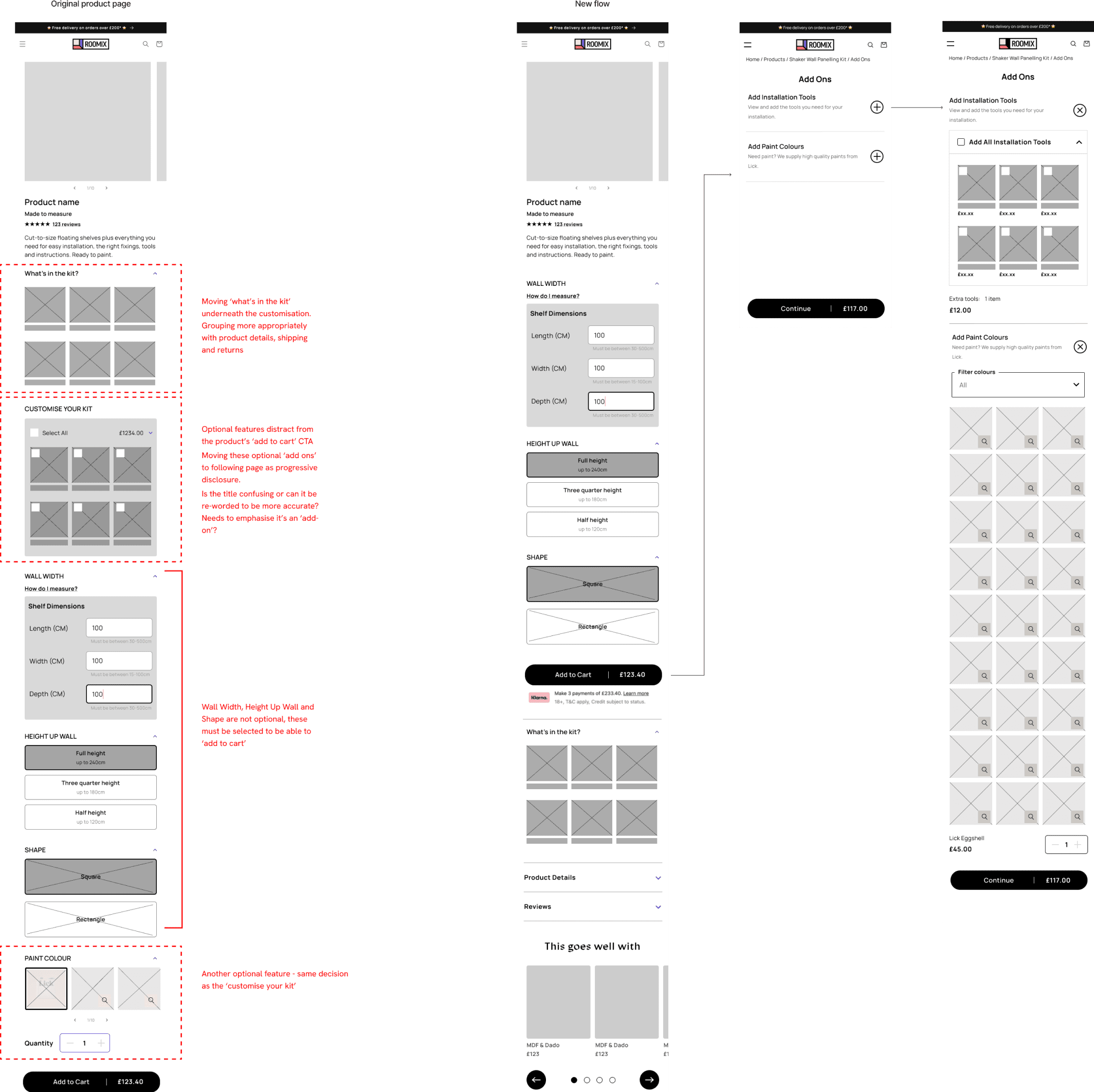

Wireframes showing updated flow with add-ons step to reduce overloading on product page
Wireframes showing updated flow with add-ons step to reduce overloading on product page
Wireframes showing updated flow with add-ons step to reduce overloading on product page
Creating modular blocks to allow for a range of different product specifications in customisation.
Creating modular blocks to allow for a range of different product specifications in customisation.
Creating modular blocks to allow for a range of different product specifications in customisation.
We created a framework that provided the flexibility to set up product pages with the required customisation information, exploring different components and interactions.
Product Page
Configuration modules
Configuration modules
Add-On modules
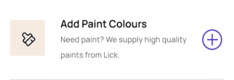

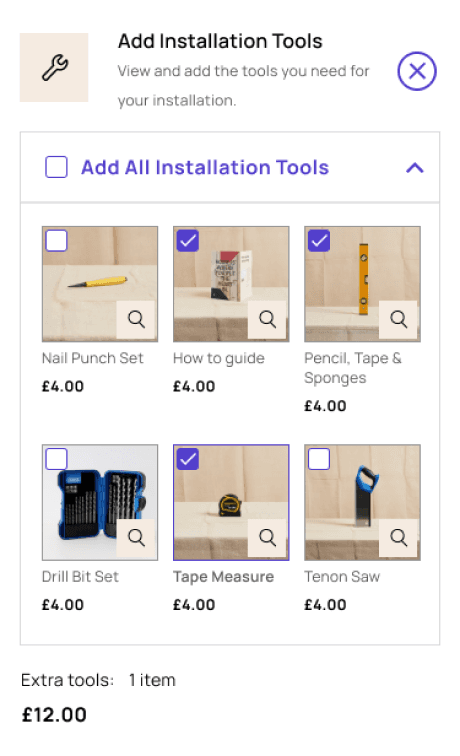


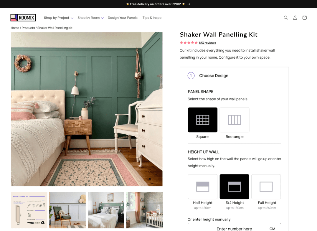

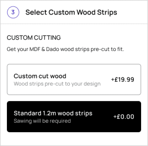

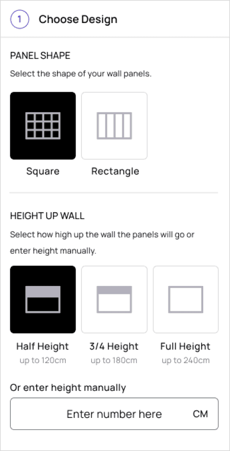

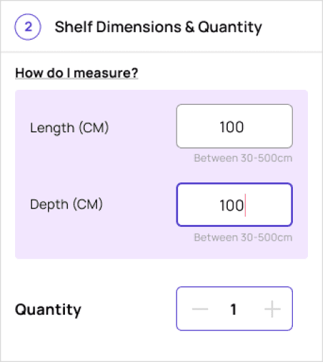

Modular customisation blocks
Modular customisation blocks
Modular customisation blocks
Landing page redesign to reflect the new direction.
Landing page redesign to reflect the new direction.
Landing page redesign to reflect the new direction.
Rearranging the page to prioritise information and sections that users were engaging with
Conveying the updated branding message of offering a more holistic range of home products
Rearranging the page to prioritise information and sections that users were engaging with
Conveying the updated branding message of offering a more holistic range of home products
Rearranging the page to prioritise information and sections that users were engaging with
Conveying the updated branding message of offering a more holistic range of home products


Original landing page
Redesigned landing page
PROTOTYPE & TESTING
A high task success rate from unmoderated usability tests with our prototypes led us to set up an AB test on various products on the website, using conversion rate as a metric for success.
A high task success rate from unmoderated usability tests with our prototypes led us to set up an AB test on various products on the website, using conversion rate as a metric for success.
A high task success rate from unmoderated usability tests with our prototypes led us to set up an AB test on various products on the website, using conversion rate as a metric for success.
However the results were mixed, showing improved conversion rate for one product type but not the other.
However the results were mixed, showing improved conversion rate for one product type but not the other.
However the results were mixed, showing improved conversion rate for one product type but not the other.
Following this feedback, we needed to distill what exact elements of the new design were working, especially in context of the product type, to implement to the final design.
FINAL OUTCOME
The final design solution for the product page ended up somewhere between the existing design and the prototype. We optimised the product pages to be easier to use, removed the overload of information and simplified the ‘add to cart’ process.
The new landing page was well liked and aligned well with the brand guidelines. The new direction in product range is clearly communicated and promoted to customers.
IMPACT
Reflecting on the project outcomes since delivery…
Initial conversion rate increased by 35%
Framework created for all future new products to be uploaded to the online store seamlessly.
Consistency in branding across the website
Currently ongoing works to simplify the copy throughout the whole website.
Here are my learnings:
01
01
Incremental, bit-by-bit changes are important to understand the effect of individual design elements. Design overhauls are never necessarily required. Small changes are sometimes all that’s needed to improve the experience.
02
02
Take a learning approach with humility. There needs to be continuous discovery and continuous experimentation to confirm learnings and assumptions. And if assumptions are wrong, that's good too, we can then take action from these insights. We know what we don't know.
Get in touch. I’d love to connect
I’m in Melbourne, Australia
Get in touch. I’d love to connect
I’m in Melbourne, Australia
Get in touch. I’d love to connect
I’m in Melbourne, Australia